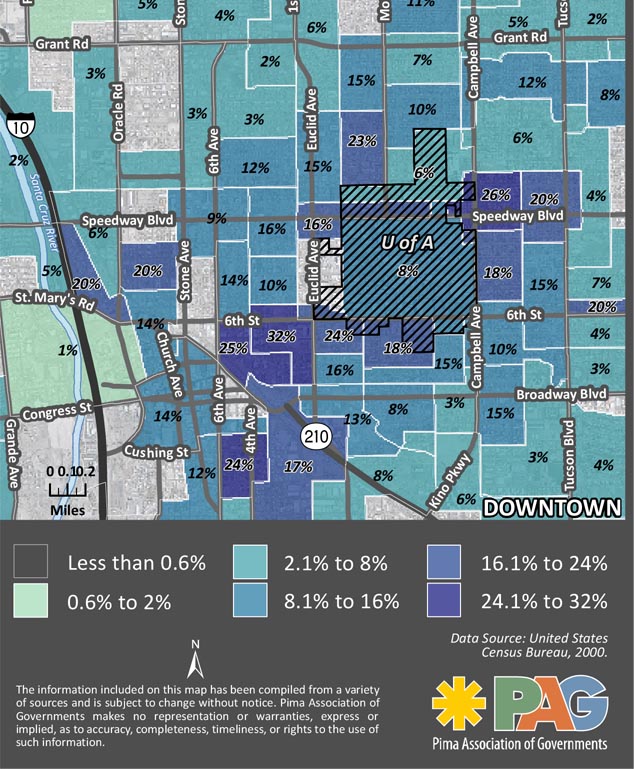
How many of your neighbors are commuting to work by bike?
A new map produced by the Pima Association of Governments uses census information from 2000 to detail the percentage of people commuting to work by bicycle. It is broken down by neighborhood blocks.
According to the map, a neighborhood near the University of Arizona had the largest percentage of people riding to work, with 32 percent.
Ann Chanecka a transportation planner with PAG, said the point of the map was to figure out where people are commuting by bike and where they aren’t and then determine why.
“You can see around the University the rates are really high,” Chanecka said. “You can take a look and say, ‘Well is it the facilities? Is it the destination? Is it the density?'”
Tom Thivener, the City of Tucson’s bike and pedestrian program manager, said based on the map it looks like the types of facilities play a part in the number of people commuting.
“If you look at our map it is clear around the UA, we have four really good facilities; Third Street, Mountain, University and Highland,” Thivener said. “Folks living right in those areas have a lot of choices on how they can get around. That is why we see so many bikes. You can follow Mountain up and the ridership stays pretty high all the way up to the Rillito.”
Thivener and Chanecka said the challenge is to figure out how to get people in the areas where few people are commuting by bike to start riding to work or school.
“They live in urban core, they are surrounded by the grid and yet they are not out there biking,” Thivener said. “Why is that? I think that is a big question that us planners have to look at. We should go out there and target those areas. I see a lot of potential.”
Chanecka said she was most intrigued by the areas that appeared to be anomalies.
“What is it about those areas that aren’t completely downtown, but people are biking,” Chanecka asked? “It is just interesting to figure out what is it about those areas that people are biking.”
Chanecka said the map is a “snap shot in time,” and unfortunately won’t be able to be recreated in the same way because the census switched to a shorter form for the 2010 census, which did not include a question about bike commuting.
According to Chanecka, the American Community Survey replaced the census when it comes to getting detailed information about people’s transportation, but it doesn’t survey everyone and doesn’t get as detailed as the census did.
Download the full map here. Is there anything that jumps out to you in the map?


Whoa, 32% in some areas? That’s awesome! I dread to think of the numbers that would show up on a map of Los Angeles.
10 year old info is just too old. Bike infrastructure & ridership in this town has changed BIGTIME since then…
This is an interesting map. But the map I’d really like to see is one that correlates high density work locations and percent bike commuters. With that view, it would be easier to identify where to invest in bike racks, shower facilities, cycling lanes, etc.
This is 2010, not 2000, and given that grant applications and other funding depend heavily on recent valid data to verify what has long been obvious to the most basic urban planning and transpo students, one might ask planner Chanecka where she goes from here and how…